Pantone Color 2022

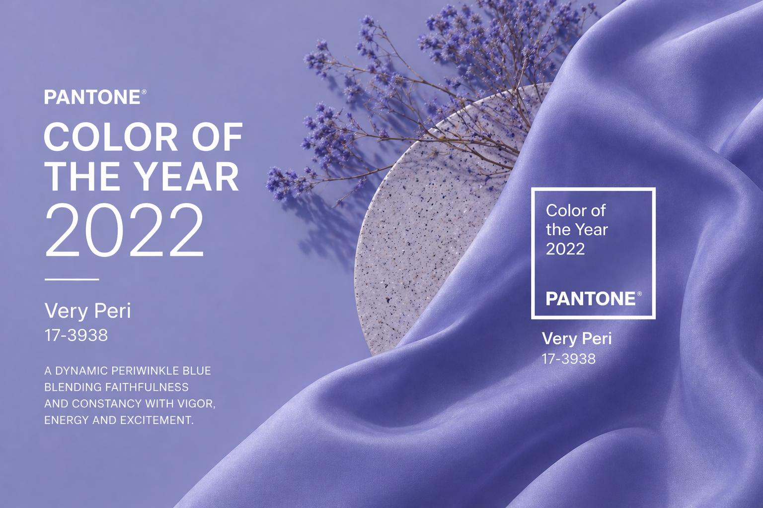
Dynamic and expressive, Very Peri symbolizes the merging of the physical and digital worlds, inspiring bold design choices in fashion, art, and technology. It’s a color that invites experimentation — energizing visual storytelling with warmth, confidence, and a forward-looking spirit.

Very Peri (#6667AB) blends the trust and calm of blue with the energy and excitement of violet-red, creating a color that celebrates innovation and imagination. Chosen as the Color of the Year 2022, it reflects a world in transformation — encouraging us to embrace change with curiosity and creativity.

MINDFUL CLARITY

BALANCED ENERGY

CONFIDENT

In the world of design, Very Peri offers a refreshing infusion of creativity. Its warm, futuristic hue works beautifully across digital design, branding, fashion, and interiors, infusing projects with a modern yet human touch. In typography and digital interfaces, it draws attention without overpowering, while in print and product design, it evokes sophistication and optimism.

Very Peri, The shade of 2022

A vibrant periwinkle with violet-red undertones, symbolizing creativity, courage, and transformation.

Pantone Color 2022

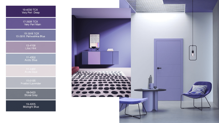
Very Peri blends the calm stability of blue with the energetic warmth of violet-red, creating a versatile palette that inspires creativity, optimism, and bold self-expression across design, branding, and lifestyle projects.

Very Peri Brought to Life​

Connecting through Design and Color

Connecting through Design and Color. In logos and overall design, Very Peri brings a sense of modernity, creativity, and innovation. Its unique blend of calming blue and energetic violet-red allows brands to stand out with a bold yet approachable personality. Designs using Very Peri feel fresh, forward-looking, and dynamic, making them ideal for companies seeking to convey adaptability and originality in a rapidly evolving market.

Brighten your world with strength and optimism

Choose fonts with confident When applied to typography, Very Peri enhances visual interest and readability. It adds a subtle vibrancy to text, balancing professionalism with a playful, creative edge. Headlines, subheadings, and call-to-actions in Very Peri draw attention naturally, giving written content an inviting and sophisticated presence without overwhelming the viewer.

Illuminate your vision with balance

Emotions and colors relationship Emotionally, Very Peri evokes curiosity, optimism, and a sense of possibility. It inspires creativity and forward-thinking, encouraging audiences to explore, innovate, and embrace change. Its energetic yet grounded tone creates a feeling of confidence and positivity, making it ideal for designs that aim to engage, motivate, and inspire.