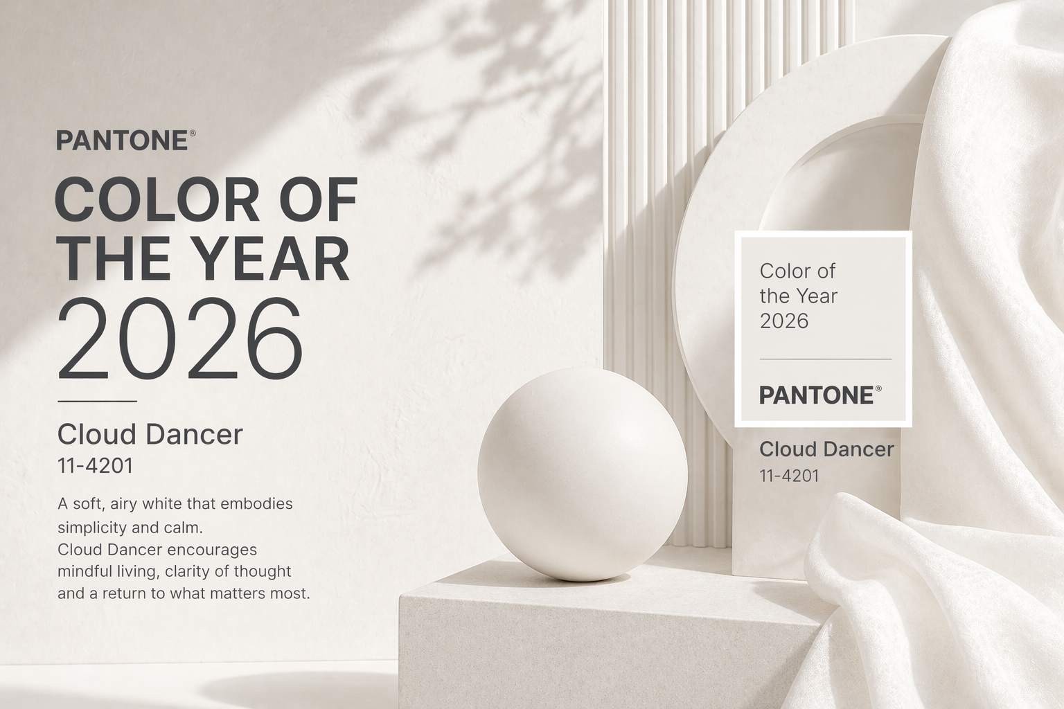
Immerse yourself in a world of stillness, renewal, and quiet focus. With its airy softness and gentle warmth, Pantone Color 2026 – Cloud Dancer invites a sense of calm presence and mindful clarity.
It reflects the soothing qualities of natural light and open space, inspiring balance, simplicity, and a refreshed state of being. This shade encourages a peaceful reset — a subtle yet powerful foundation for creativity, harmony, and forward movement.
Cloud Dancer – Pantone Color 2026 reflects a collective longing for calm, clarity, and mindful presence. Its gentle warmth and airy neutrality make it a symbol of renewal — a quiet yet powerful foundation for wellness, balance, and intentional living in 2026.
Across fashion, interiors, branding, and lifestyle design, Cloud Dancer emerges as a lens through which we reimagine simplicity and serenity. It evokes the quiet purity of natural light, soft textures, and open space — offering a gentle backdrop for modern minimalism and emotional clarity. With its subtle warmth and airy neutrality, Cloud Dancer provides the calm foundation needed to express new narratives of balance, renewal, and intentional living.
Connecting through Design and Color
In Cloud Dancer, the humble cup becomes an emblem of purity, calm, and refined simplicity. Its soft, clean silhouette is elevated by the gentle warmth of the shade, creating an experience that feels both soothing and intentional.
Each sip becomes a moment of quiet clarity — a reminder that design is not only visual but emotional and sensory. Cloud Dancer transforms everyday objects into expressions of balance and mindful elegance, infusing daily rituals with serenity and inspiration.
Immerse yourself in Transformation
Typography in Cloud Dancer radiates subtle confidence and effortless harmony. The shade’s airy neutrality softens sharp contrasts, enhancing legibility while promoting a sense of calm precision.
Whether paired with sleek modern typefaces or delicate, expressive scripts, Cloud Dancer brings coherence and poise to every composition.
It’s a color that speaks before the words do — guiding the reader’s eye with purity, balance, and timeless presence.